| I have - on occasion - been trying to mimic the look of traditional-art materials in Blender, starting with Nyrath's post on Deviantart, which in turn inspired me to try out different solutions and compare them to each other. |
Of course this status-quo didn't hold up, and I saw this post some time later. I wanted to react, using my own creation, but none of the results were holding up.
 Now construction individual Node-setups would require a lot of work, and also one would need to create a unique setup for most techniques, if not more for different angles and light setups.
The whole thing fell quiet for a while until I recently became obsessed with learning to use watercolour, mainly because of my dissatisfaction with the tools available to me. That's where I had my little eureka Captain Obvious moment.
When you try to learn to paint, you usually - at some point - start to paint shaded spheres, because it sort-of never looks right. Now in CG we have something astonishingly similar, namely: Matcaps.
Embarrassed, that I didn't think of this solution earlier, I started to draw and paint different shaded Spheres, feverishly scanning them, to try out my solution, and here it is.
Regularly, you use your Matcaps shadeless, since the point about them is that they provide their own kind of shading. On a side-note, I really love that they still raytrace correctly and have intact shadows and reflections (because why shouldn't it?).

This has some Merit as in it doesn't need an awful lot of Rendertime. While it produces some nice (quick and dirty) results, I'm not really satisfied, but I can see me using them.
I usually like to render some additional shading onto my Matcaps to make them look less artificial, which produces some interesting results. Using the shaded Ball as inverted Normal/Bump-map adds a nice effect too.

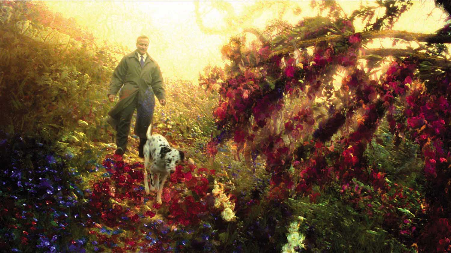 That's where I started to remember the Movie "What dreams may come", which had some great art direction. There is a passage, in which the protagonist arrives in one of the Paintings of his dead wife, where - consistently - everything is made out of Paint (As far as 1998's special-effects take you anyway). Still it's kind of awesome work, and a big part of it easily stands the test of time. Also It's a Robin Williams movie.
This, and the fact that I really like Subsurface scattering, led me to liberally applying said technique to the Materials, to make the Suzannes in my scene appear less solid. (Now that I think of it, there's also a remarkably similar scene in "Hook", he seems to have had a thing for eating paint…)

I like that result, also it had a rather nice effect on the Ink-Suzanne as well.
Now there seems only one question left - Is this useful in animation? This of course largely depends, and I doubt that there is a lot of 'real' watercolour animation out there (forgive my ignorance, everything is out there, but not particularly what I meant), but it might have a lot of inconsistency on a frame-by-frame basis, but of course they could be baked.
Since this has to be tried out for completeness sake, I decided to render some short camera-flybys of my demo scene with shadeless and SSS Suzannes, just to find out what it would be like.
I still have to try this with fluids - I particularly imagine this effect great with soft-particle fluids and high viscosity (also I think that fluids that behave like paint, but look painted rather than paint are sort-of a funny concept). Time will tell how this Idea holds up. It's probably also worth mentioning that this works in Blender's game engine as well (and is not very resource-hungry, especially when shadeless, although one could use fake-SSS).
My overall conclusion is, that this is a potentially nice technique, and should be applicable to anything you can do on paper, or even in your favourite Image editing program. Still it doesn't beat that magnificent ink-shader.
My overall conclusion is, that this is a potentially nice technique, and should be applicable to anything you can do on paper, or even in your favourite Image editing program. Still it doesn't beat that magnificent ink-shader.